In a competitive world of corporate jobs and academic roles, few documents have as much impact as CVs and resumes. Still, writing a compelling curriculum vitae is not the only thing you should keep in mind; you also need to have a strong CV format that makes it easy to read and enjoyable to look at.
So, how exactly should you structure your document, and what settings should you use to turn ordinary (or even messy) writing into a methodical and businesslike form?
You might be telling yourself that you’re not a graphic designer and that these things shouldn’t matter. The good thing is that you don’t have to be an artist to craft an outstanding CV. All you need is an easy guide and a couple of tips, and that’s exactly what this article is about. Let’s get started!
Key Takeaways
CV formatting should include a professional font with 10–12 pt size, at least 1-inch margins, and 1.0 or 1.15 line spacing.
Your CV should feature contact information, a personal statement, work experience, education, and skills. You can also include some of the optional sections.
The reverse-chronological CV format is the most common, and it’s used by candidates with a regular work history.
The skill-based CV format is tailored toward entry-level candidates and those with irregular work histories, as it emphasizes abilities over experiences.
How to Format Your CV

You should format your CV so that the information is presented in an organized and professional manner. Good CV writing ensures that the sections follow an established order, and the design of the document needs to be easy on the eye while the writing is easy to read.
In that sense, a CV should be structured similarly to a resume layout. While these two documents are one and the same in Europe and many other parts of the world, there are differences in the US.
In the US, a resume is a concise (usually one-page) document written when applying for jobs in the corporate sector. US CVs are used for roles in academia and represent individuals’ entire academic histories. As a result, they can be much longer (sometimes ten pages or more) and more detailed.
Since recruiters and hiring managers need to go through all that content, you want to format your CV to get the perfect layout and get their attention. Here are some tips on how to get there:
CV Layout Guidelines
Choose a suitable font for your CV, such as Times New Roman or Arial.
The font size should be 10–12 pt, with section headings being 2–4 pt bigger.
Set margins to 1 inch on all sides. You can increase the values slightly, but not too much.
Use line spacing of 1.0 or 1.15.
CV Format Overview: How to Write Your CV
Now that we have learned about visual formatting, let’s find out how to format your CV structurally. We’re going to examine the key sections that you should include in your CV, how you should write them, and in what order.
#1. Contact Information
Contact information is a staple section in most of these types of documents, including CVs, resumes, cover letters, and motivation letters. It involves factually listing the following details:
Mandatory Contact Information
Your full name
Phone number
Email address
Location
Optionally, you can include your professional title and links to relevant social media, like LinkedIn. Let’s see what that looks like in an example:
Contact Information Example
Edgar Mitchel Computer Science Specialist
480-429-4135 edgar.mitchel@email.com Scottsdale, AZ linkedin.com/in/edgarmitchel
Here are some tips to help you perfect this part of your CV:
Contact Information Tips
Use a professional email address. If you still have a juvenile address, you should create a new one to use in a professional setting.
When adding location, it’s often enough to include just your city and state. Unless the recipient explicitly asks for more, you should avoid adding the specifics for security reasons.
#2. Personal Statement
A personal statement is a short introductory paragraph that the hiring manager will usually read first. That’s why it needs to be impactful and catchy—to grab their attention and persuade them to take a look at the rest of the document.
To write a strong personal statement, you should highlight your key achievements, qualifications, and career goals. This means you can include everything from your degrees and certifications to the amount of experience you have in the field and the results that you have obtained.
Here’s an example:
Personal Statement Example
Diligent recent graduate in computer science looking for an entry-level position at [Company’s Name]. Notable skills include proficiency in JavaScript (with a focus on the Angular framework) and Python. During the internship, developed an in-house library app using HTML and CSS with Node and React.
#3. Experience
Experience is often an essential part of a CV. It is usually the document’s centerpiece, the biggest section in it, and the one recruiters spend the most time looking at. That’s why you need to make it spotless. Start by including the following details:
Experience Mandatory Details
Your position
Company name
Dates of employment
Responsibilities and achievements
The key is getting the bullet point list with achievements right. Here are some tips on how to do that:
Experience Section Tips
Focus on exceptional results over everyday tasks.
Use action verbs to make the writing pop.
Include numbers to add weight and measurable value to your accomplishments.
Highlight achievements that are relevant to the job that you’re applying for.
Let’s see that in an example:
Experience Example
Experience Computer Science Specialist
Platform Development Miami, FL
June 2022–December 2023
Developed 5 custom troubleshooting tools for an e-commerce client.
Leveraged machine learning to help a client save $35,000 in a year.
Mentored 3 junior developers and helped them maximize their output in 6 months.
#4. Education
The education section is one of the simplest ones to include in your CV. It’s usually enough to list your highest degree, the institution that issued it, and your graduation year. Here’s what that looks like in practice:
Education Example
Education
B.S. in Computer Science, 2019 University of Pittsburgh
You can make this section more prominent by including additional details in bullet points, like:
Education Optional Details
Dissertation or thesis title
Relevant coursework
Extracurricular activities
High GPA (3.5 or higher)
Notable achievements
If you’re still studying, you should list an expected graduation year. You can also list more degrees in reverse-chronological order. However, you shouldn’t add your high school diploma unless it’s your highest one.
#5. Skills
The skills section of your CV is all about highlighting your relevant hard and soft skills. In the context of your CV format, this section should feature a simple list of these abilities.
Hard skills should be mentioned first since they are job-specific. It’s often necessary for you to have the required hard skills to apply for a position in the first place. These abilities are easily verified and can be backed by diplomas and certifications.
After that, you should include several notable soft skills. These are transferable between jobs and generally much more challenging to prove than hard skills. Still, recruiters and employers always look for candidates with strong sets of soft skills.
While hard skills depend on your career or even a specific position, soft skills are universal. Some of the most prominent ones that you can list in your CV are:
Soft Skills Example
Leadership
Management
Critical thinking
Decision-making
Problem-solving
Teamwork
Attention to detail
#6. Other Sections
There are many other sections that you can add to your CV to improve it. While they are optional, they can add a ton of value and make you stand out in the eyes of recruiters.
If you’re a seasoned veteran, optional sections can help portray you as a true authority in the field. In that case, you can consider adding some of the following sections:
Optional Sections
Awards
Certifications
Conferences
Professional memberships and affiliations
On the other hand, if you’re an entry-level candidate or even a student, you can use optional sections to make up for modest professional experience. These sections can help you do that:
Entry-Level/Student Mandatory Sections
Personal projects
Freelance work
Hobbies and interests
Academic accomplishments
5 Well-Formatted CV Templates
Here are some examples of differently formatted CV templates to help you visualize everything that you’ve learned so far. Whether you’re looking for a CV format for a teaching job or a C-suite role, you’ll find these examples to be good starting points.
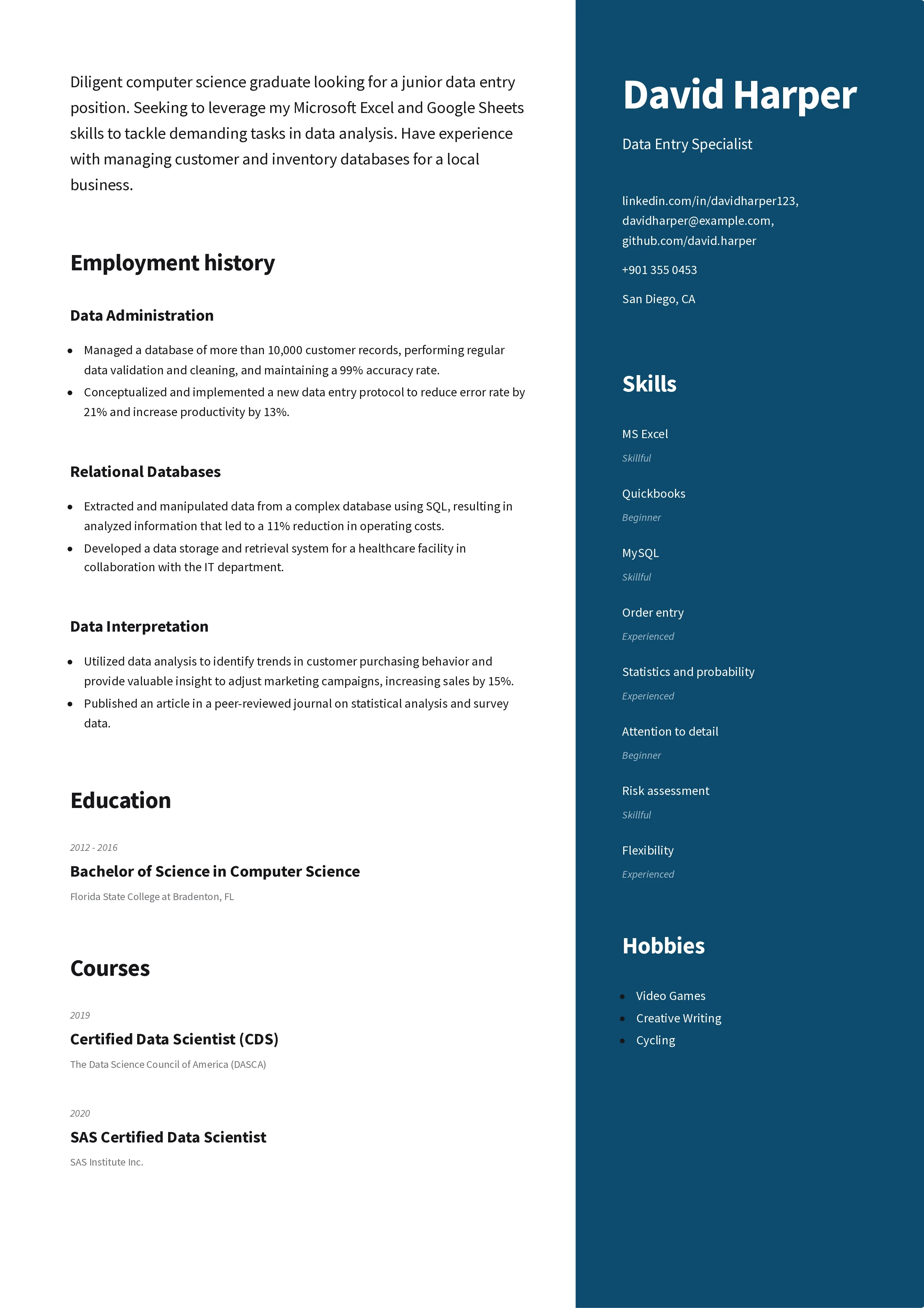
#1. CV Format for Students
This is a simple CV format created to help students and entry-level job seekers highlight their key strengths:
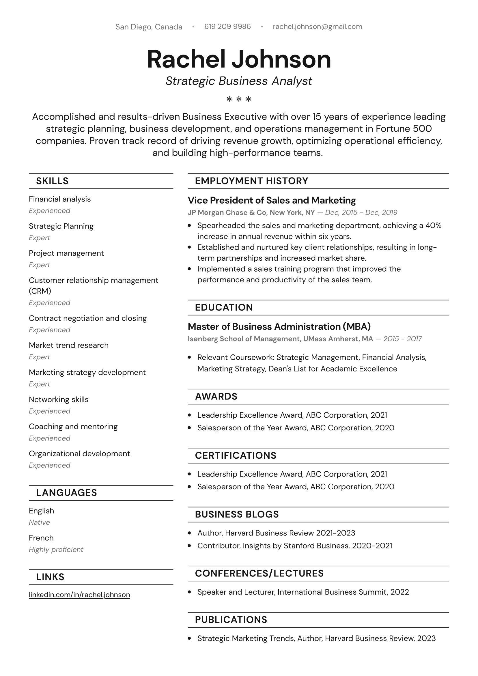
#2. Professional CV Format
Here’s a professional CV format designed with executive roles in mind:
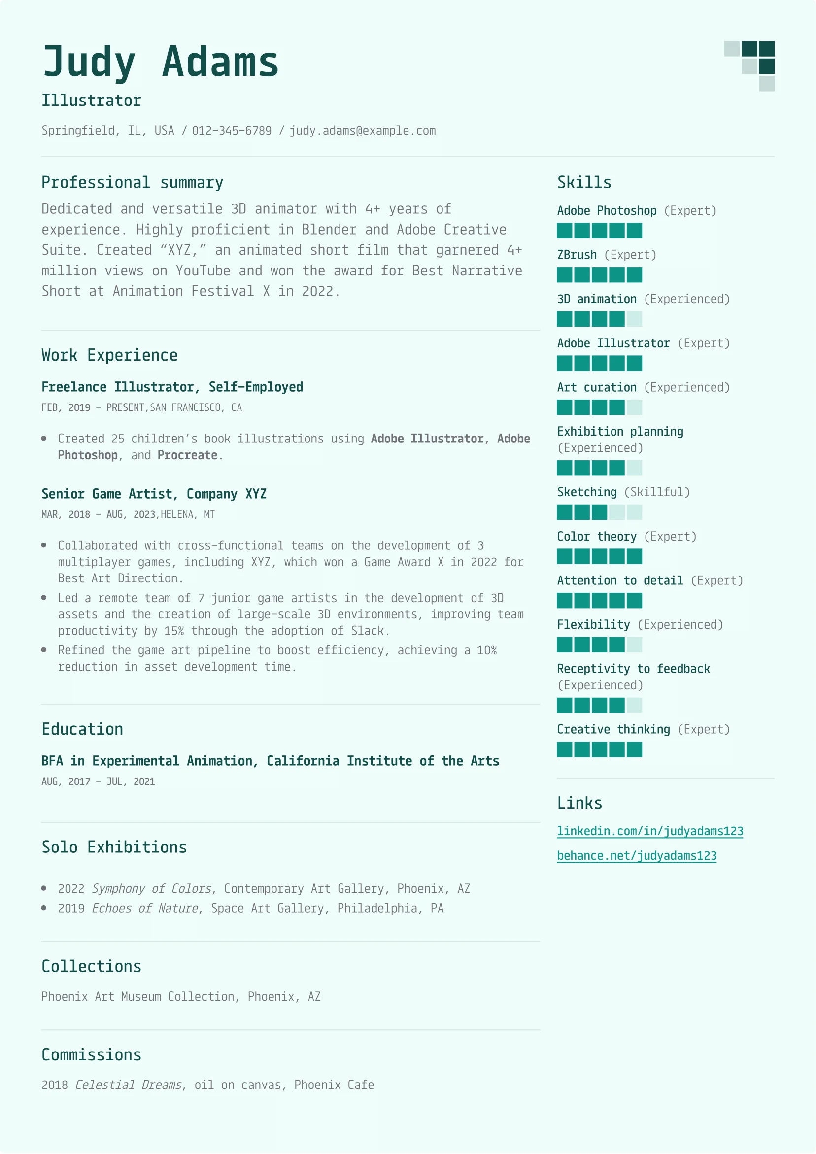
#3. Modern CV Format
This modern CV format is built to be universal and applicable to many different roles:
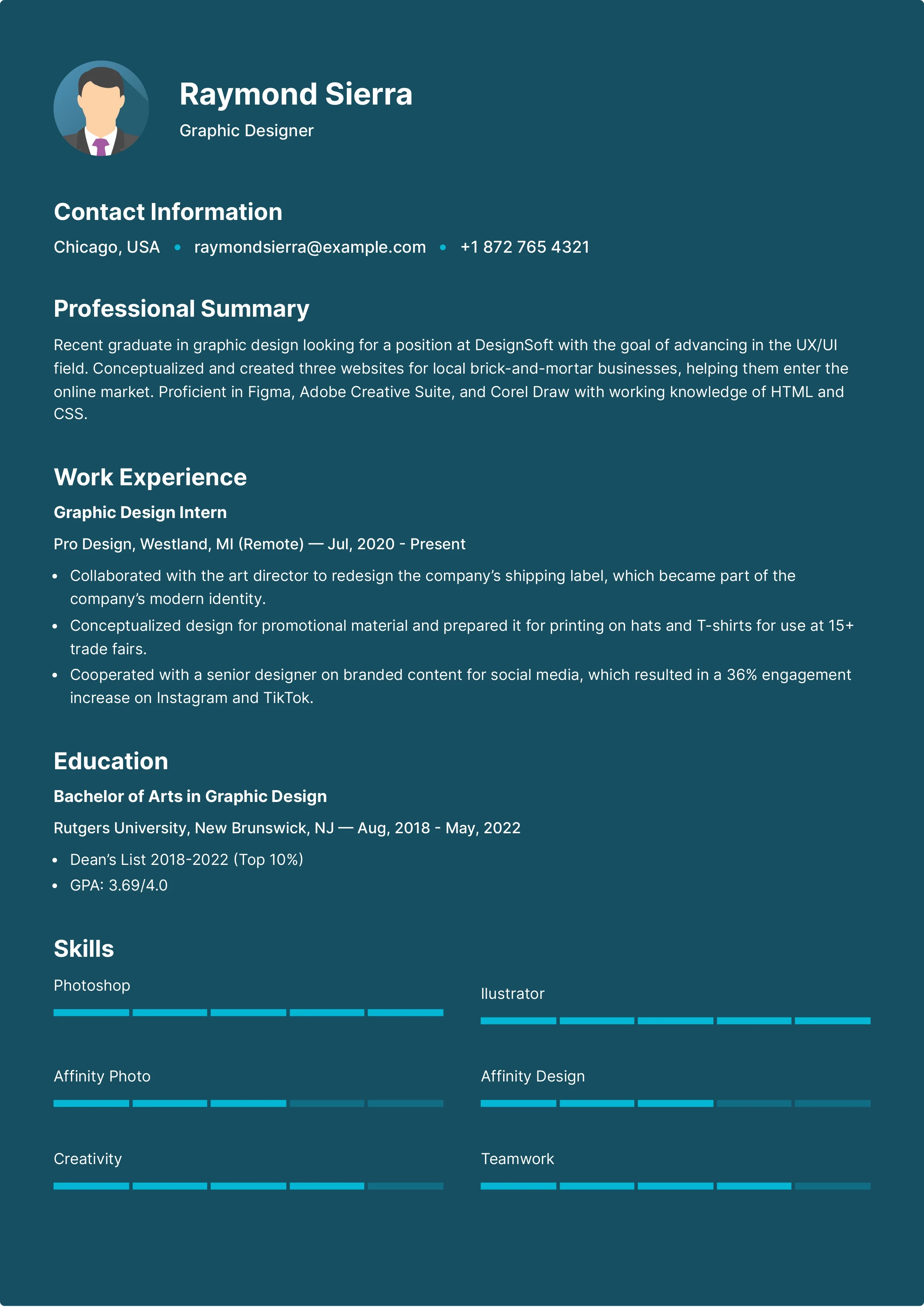
#4. Artistic CV Format
If you want to add some tasteful flair to your CV, this format is for you:
#5. ATS CV Format
This ATS-friendly CV format is purpose-built to pass the applicant tracking system scan:
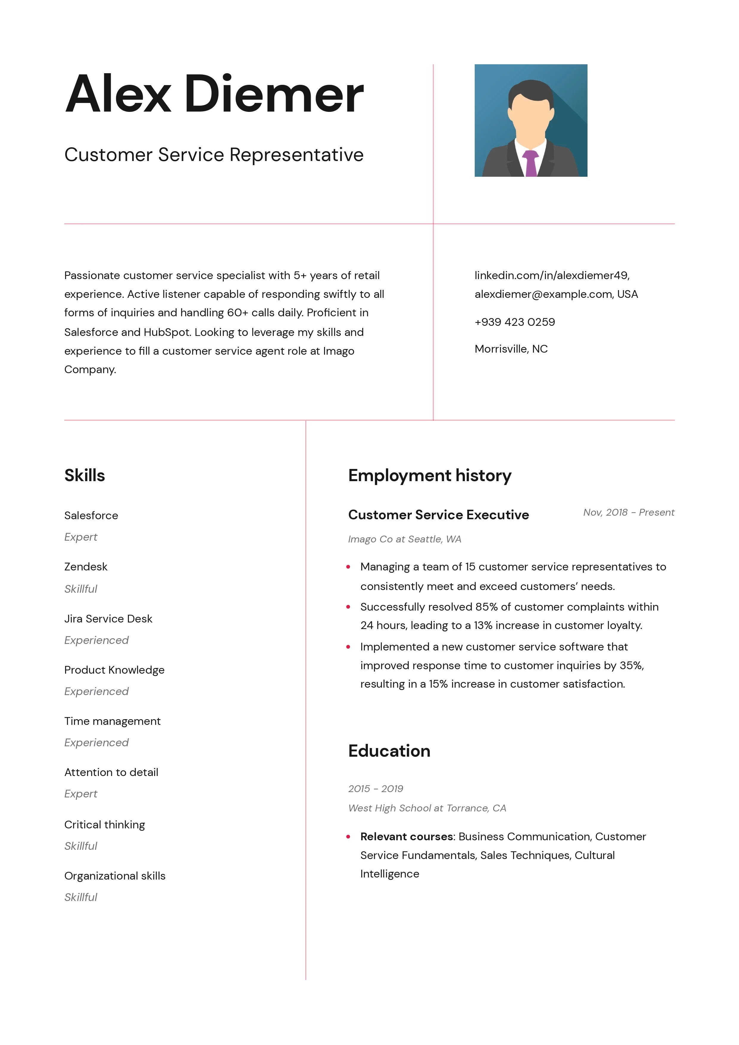
Reverse-Chronological vs. Skill-Based CV Format: Which One Is Better?

Reverse-chronological and skill-based CV formats both have pros and cons and should be used in different circumstances.
The reverse-chronological format is the most common format, and it’s perfect for those with a steady work history. The format lists past jobs in reverse-chronological order, starting with the latest one. The main benefits of such an orderly arrangement of the sections are that this format is a recruiters’ favorite and ATS-friendly.
A skill-based CV format is good for freshers, students, entry-level candidates, and everyone with a modest professional history or plenty of employment gaps. This format forgoes the established structure of the reverse-chronological one to emphasize a candidate’s skills. As such, it allows less experienced candidates to play to their strengths.
Ultimately, no format is better than the other in every aspect. The best CV format for a job that you’re applying to depends on the role and your circumstances.
Expert Strategies for Formatting Your CV
Now that we’re done with the guide, here are some final expert tips and strategies that will turn your CV from good to awesome:
CV Format Tips
You should ensure consistency throughout the entire document. That includes choosing one font and not changing its size (except for section headings), using colors sparingly, making sure all bullet point lists are the same, having uniform line spacing, etc.
You should submit a soft copy of your CV as a PDF. While you can use Word to format your CV (or any other software, for that matter), you should export the document into PDF to ensure it preserves its formatting on any device.
You can use white space to make your CV more readable. Adding space between sections makes it so that your document doesn’t look cramped. Different parts of it become distinct and easier to spot. That improves the reader’s experience and keeps them engaged.
You can format your CV so that it has a better chance of passing an ATS scan. Some steps that you can take include following the established section arrangement outlined in this article, using the reverse-chronological format, researching the job ad for required skills and job titles to use as keywords in your CV, and more.
Final Thoughts
A CV is one of your most valuable tools in today’s business landscape, and a strong format ensures that you can get the most out of it. Making a document that’s pleasant to look at and easy to read is essential to capturing the attention of recruiters and potential employers.
More than that, a properly formatted CV gives the reader what they want to see when they want to see it. It keeps your unique skills, experiences, and qualifications on full display while making them interesting and visually appealing.
Finally, you can always use our online builder to format your CV and download it in minutes. That way, you’ll be sure that your document is crafted by industry professionals!


