
Resume colors influence how your document is perceived and can improve its readability. They can also add a touch of elegance, help you emphasize particular sections, reinforce personal branding, and highlight your knowledge of the industry. However, you should be thoughtful when adding colors to your resume, as overdoing it can have a negative impact.
In this article, we’ll talk about color psychology in resumes and its importance. We’ll go through some of the most common color combinations that can improve your document, discuss tips on how to use them best, and mention critical mistakes you should avoid. Let’s get started!
Key Takeaways
Resume colors won’t make or break your job application, but when used smartly, they can help you grab attention and stand out.
Black, navy blue, and charcoal are professional resume colors and safe choices for traditional fields, while bolder ones like green, purple, orange, and even red should be used only in specific circumstances (e.g., for creative roles).
When adding color to your resume, use it sparingly, sticking to one or two tones and avoiding oversaturated shades.
Are the Colors of Your Resume Really Important?
The colors of your resume are important, as they influence its visual appearance and legibility. While they can’t be a replacement for well-written content and exceptional skills and qualifications, they can help your document stand out and grab the recruiter’s attention.
Clever use of color in resumes can draw the reader’s eye toward essential details, helping you emphasize your prowess and present yourself as the best candidate for the role. However, it’s vital not to overdo it, as too much color or incorrect shades can be distracting.
It’s important to note that the use of color generally doesn’t impact compatibility with the applicant tracking system. An ATS-friendly resume design stems from a professional resume format and structure, so color won’t improve your ATS score. However, if your color contrast is too low, it can make it impossible for the ATS to scan your resume.
Resume colors can be particularly helpful in highlighting personal branding and making your application more memorable. Moreover, they can be a valuable tool for professionals in the creative industries who want to demonstrate their expertise from the get-go.
The Psychology of Colors and What They Represent
Before we talk about some of the best colors for resumes, let’s explore the psychology behind them to better understand why and how they are used.
However, in addition to their regular meaning and use case, it’s important to be aware of cultural considerations when choosing colors. For instance, while red can be associated with danger in Western culture, it signifies luck in many Asian countries. As such, it’s critical to consider your audience when selecting resume colors, especially for global markets.
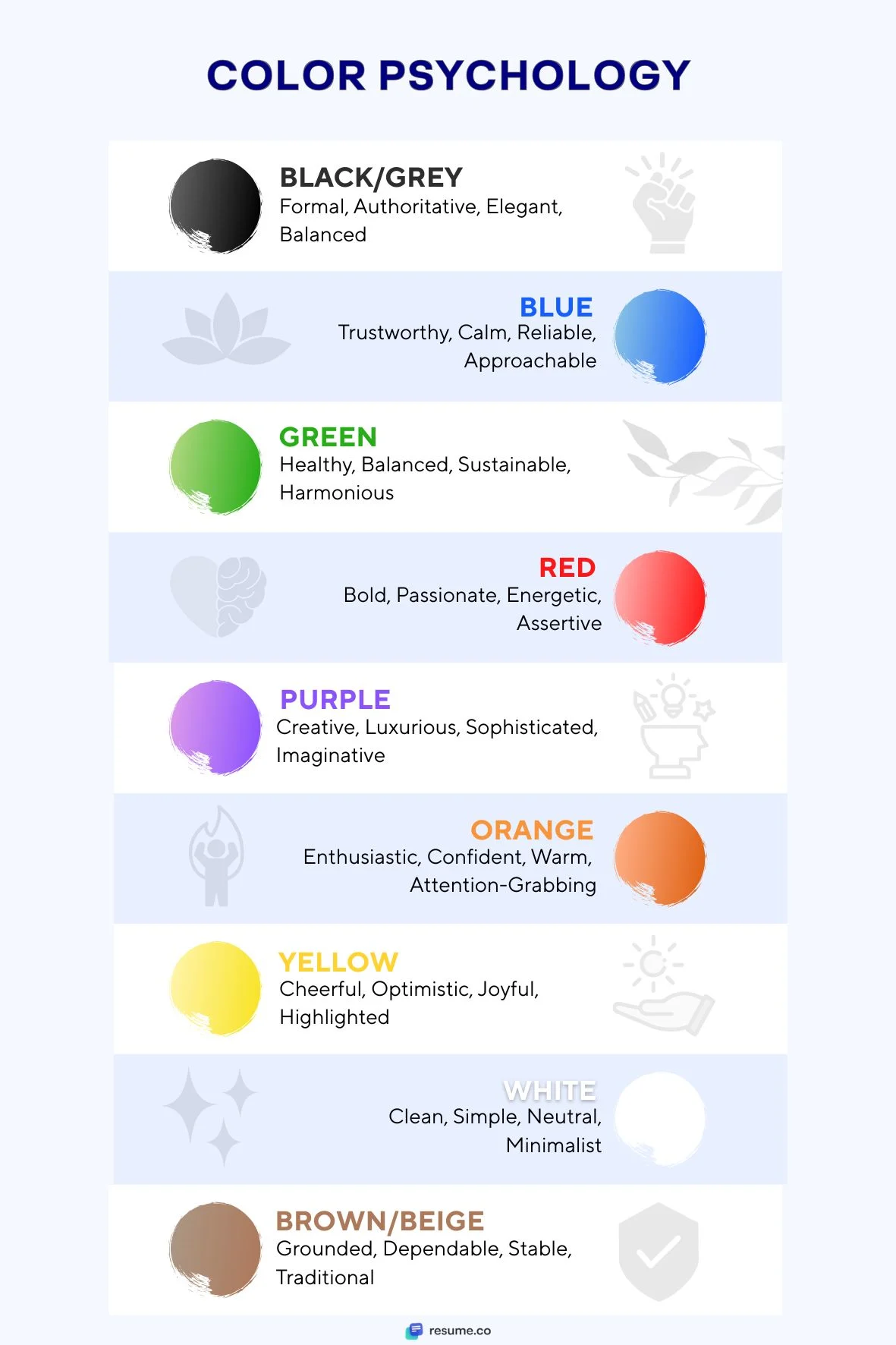
Black/Grey
Black is a classic choice and a standard color used in business correspondence. It’s traditional, formal, and authoritative. When used on white paper, it provides high contrast for maximum readability.
Grey is a similarly formal choice that adds softness compared to black. It maintains a professional appeal while adding balance to the aesthetic. Plus, its shades can be used in combination with other colors across most industries.
Blue
Blue is another color frequently used in a business environment. It conveys trust and reliability, which is why it’s utilized by many companies and organizations in finance and healthcare spheres.
Darker shades, such as navy blue, are highly versatile and effective in almost any industry, demonstrating confidence and stability. On the other hand, lighter variations have a calming effect and can portray you as more approachable.
Green
Green color is often associated with growth, balance, renewal, and harmony. It’s frequently related to nature, which makes it common in healthcare and environmental sectors, as well as professions tied to sustainability.
Red
Red is a bold and energetic color that’s synonymous with passion, power, and action; it can be highly effective at drawing attention, but overusing it is risky as it can come off as aggressive. This color is best used sparingly, especially in business correspondence and documents like resumes and cover letters.
Purple
Purple is an unconventional color in business communication, typically associated with concepts such as creativity, luxury, and imagination. It can provide a middle ground between the stability of blue and the energy of red.
Darker tones of purple can have a similar effect to navy blue and offer reliability and sophistication. This makes purple a good choice for artistic roles and industries that value out-of-the-box thinking.
Orange
Orange is a highly dynamic color that exudes confidence and enthusiasm, so it can be used to communicate warmth and optimism. It’s also great at grabbing attention, which is why it’s often leveraged in marketing.
However, orange should be used sparingly, just like red; it should also be combined with neutral colors to avoid overwhelming the reader with a visually busy document. For the same reasons, it should not be used in conservative fields.
Yellow
The color yellow is often associated with cheerfulness and optimism. However, using it for text on a white background (especially if it’s a lighter shade of yellow) can make it difficult to read and even cause eye strain. That’s why yellow is mostly reserved for accents and highlights.
White
White is known as a clean, simple, and neutral color. It’s typically associated with minimalism and is a standard background color, since most papers are white. A white background with dark text or graphical elements is an effective way to provide contrast and enhance readability.
Brown/Beige
Brown and beige colors convey a sense of stability, reliability, and conservatism. They aren’t as common in resumes as other colors, since they often aren’t as attention-grabbing. However, such tones can be especially effective in education and non-profit fields, showcasing a grounded mindset and the value of tradition.
Best Color Combinations for a Resume
Now that we understand the background behind standard colors used in business and design, let’s explore some of the most effective resume color combinations. You can see many of these in practice by exploring our resume examples and resume templates.
#1. Black + Blue
Black and blue is a classic pairing of resume colors that offers a clean and professional look. Blue is used to add a touch of creativity to a black-and-white resume while still maintaining its formal nature. It softens the effect of black without reducing the document’s readability.
Shades of blue (especially navy and medium) can be used for specific elements, like section headings, your name, or graphical elements. Using blue like this allows you to add color to your resume without making it too invasive.
All of this makes black and blue an ideal choice for conveying trust and stability, and a great combination for more traditional fields (e.g., a financial analyst or paralegal resume).
#2. Dark Grey + Teal
Dark grey and teal resume colors represent a contemporary and more creative variant of the black and blue combination. Using them can help you appear modern and approachable, while making your resume subtly sophisticated.
Besides that, dark grey is a softer alternative to black, and it can be used uniformly or in different shades for section headings and regular text. Teal, as a blend of blue and green, is used as a substitute for navy and medium blue. It highlights creativity without being overly distracting.
These colors are ideal for technical resumes or when applying for jobs in telecommunications.
#3. Navy + White + Accent
The combination of navy and white is timeless and authoritative, and it’s a good substitute for a black and white resume. Including an accent color like dark red, bright blue, or gold can add a touch of elegance and creativity to an otherwise formal document, giving it a bold yet balanced look.
Navy text for section headings on a white background should dominate your resume. Accent colors can be used for subtle graphical elements, like lines and icons. It’s important to let the contrast of dark blue and white take priority, without accent colors overpowering it.
#4. Dark Green + Beige
The combination of dark green text and graphical elements on a beige or cream background in a resume is great for green careers. A beige background gives the document a softer look than stark white, while dark green conveys growth and stability. In combination, they make a resume appear warm and grounded, hinting at your environmentally conscious nature.
As a result, these resume colors are great when applying for companies that have a strong focus on sustainability. The combination is also good when applying for roles in agriculture and wellness, helping your resume match industry characteristics.
#5. Charcoal + Light Blue
The combination of charcoal text and graphical elements on a light blue background gives your resume a trustworthy and minimal appearance. These resume colors create a sophisticated look and a modern take on using black for writing on a white background.
While charcoal and light blue give a softer contrast compared to traditional resumes, they maintain a clean and professional appearance. This makes them suitable for various industries (e.g., an education resume or a nurse resume).
Best Colors for Resumes by Industry
While personal preference, artistic flair, and a specific role influence resume aesthetics, it’s often best when they align with the industry you’re in. Let’s explore how industry norms dictate which resume colors to go for.
Corporate/Finance/Law
Corporate, finance, and law are formal and traditional industries where it’s recommended to go with conservative and authoritative resume colors.
You can’t go wrong with a black text on a white background. If you want to add a touch of color while maintaining a professional appearance, you can opt for navy blue or charcoal. These colors should mainly be used for section headings, and they can help differentiate parts of your resume while still conveying seriousness and trustworthiness.
Creative Fields
When applying for a job in a creative field (e.g., with a marketing resume or a graphic design resume), you can use more color to demonstrate personality and a knack for aesthetics.
There are several factors to consider when selecting the colors to include in your resume. You should consider the industry you’re in, the company, the role, as well as your personal style, brand, and preferences.
For instance, you can explore purple to highlight creativity and imagination, orange to demonstrate enthusiasm, teal for a modern look, or tasteful red to showcase boldness.
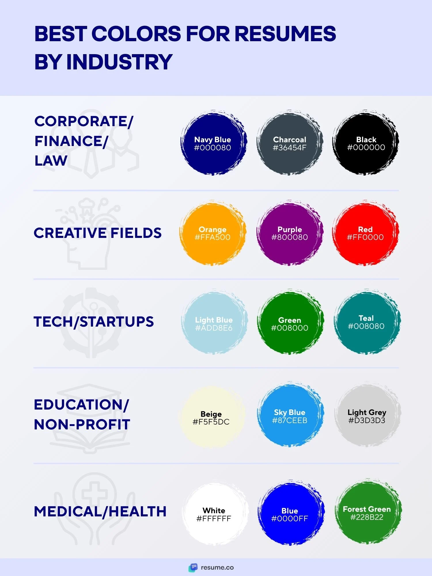
Tech/Startups
If you’re looking for a job in tech or at a startup company, you can use blue and green tones for your resume. Blue is associated with trust and reliability, while signaling a forward-thinking approach, while green emphasizes growth and hints at fresh and innovative ideas.
On the other hand, you can explore modern contrast combinations, like charcoal with light blue or teal. Moreover, you can also use different shades of grey to the same effect with more expressive colors, particularly if that matches the casual culture of a small startup.
Education/Non-Profit
When applying for a position at an educational institution or a non-profit organization, your resume colors should convey warmth and a grounded approach. As a result, you can use gentler tones of blue, green, and grey.
Shades of beige or cream for a background can further soften the contrast, helping you achieve a professional yet approachable feel.
Medical/Health
Combinations of blue and white work exceptionally well for medical and healthcare resumes, as they convey the feeling of trust and cleanliness. Darker or muted shades of green are also associated with health and well-being, and can be used sparingly to create a professional healthcare resume.
5 Tips and Best Practices for Using Colors on Your Resume
Let’s take a look at five essential resume design tips and practices when using color.
#1. Use Color Sparingly
If you decide to add colors to your resume, you shouldn’t overdo it. The bulk of your writing should still be in black, while you can use colored section headers, your name, and graphical elements like icons. You can also add a light shade for parts of your resume’s background or all of it.
#2. Stick to 1–2 Colors
Even the most colorful resume examples that appear professional typically use a maximum of two colors. Anything more than that will make your resume look inconsistent and unprofessional, reducing its legibility and clarity.

#3. Ensure Readability
Regardless of the color combination you decide on, ensure readability by maintaining sufficient contrast. All colors you use for section headings and graphical elements should be darker tones, while the background should always be close to white.
#4. Avoid Oversaturation or Neon Colors
Oversaturated or neon colors might make your resume stand out, but they are too jarring on a business document and thus highly unprofessional. Moreover, they are too distracting and difficult to look at, further discouraging recruiters from reading your resume.
#5. Consider Accessibility
Some recruiters and employers can have color vision deficiencies, which prevent them from reading resumes with insufficient contrast. To ensure your resume has enough contrast, even for colorblind individuals, you can use contrast checker tools.
5 Colors You Shouldn’t Use on Your Resume

Let’s wrap up this comprehensive guide by mentioning some resume colors you should never use:
Bright yellow. You should never use this color for text or essential graphical elements, as it’s very hard to read on a bright background.
Neon colors. Fluorescent and neon shades are also difficult to read, while also being too distracting and unprofessional.
Bright purple. Similar to neon colors, it is considered highly unprofessional, even when applying for a creative role.
Bright red. Red should be used sparingly, typically in muted or burgundy variants. Otherwise, it comes off as aggressive.
Light pastels for text. When used in combination with a white background, they don’t provide enough contrast.
Want to upgrade your resume?
Design a new one in minutes with our resume builder.Final Thoughts
When used thoughtfully, resume colors can help your document stand out and effectively emphasize the most important information. In addition to choosing the colors strategically, you also want to use them sparingly to ensure your resume looks professional.
Avoid bright and neon colors, and ensure that your resume has sufficient contrast. Follow the norms of your industry and remember that less is more. If you’re unsure of which color to include and none of our modern resume templates suit your needs, you can always go with the traditional black and white.
Resume Colors FAQ
#1. What’s the best resume color for 2026?
The best resume color for 2026 depends on the industry you’re in and the role you’re after. While black and white remain timeless, you can utilize shades of blue and grey for variety, while maintaining a professional look. Teal, green, and beige can provide a softer, modern appearance.
#2. Can color affect how a resume is read by ATS?
Color can mostly negatively affect how a resume is read by ATS if the contrast is too low. Light text on a light background or an overwhelming amount of dark color can also interfere with screen software, resulting in poor ATS results.
#3. Are colorful resumes unprofessional?
Colorful resumes aren’t unprofessional by default, but they can be, depending on the style and industry. When used subtly and with taste, colors can help a resume stand out even in traditional fields. However, if you’re unsure about using resume colors, you should stick to black on white.
#4. Should I use the same color as my LinkedIn profile?
While you don’t have to use the same color as your LinkedIn profile, it can help with your resume branding. Using consistent colors across your application documents, social media profiles, and portfolios creates a cohesive package and helps you stand out and be more memorable.
Related Articles
Resume Design: A Comprehensive Guide with Tips and Tools
15 Best Fonts for a Resume in 2025 Curated by Hiring Experts
Top Resume Trends in 2025: Emerging Best Practices Explained

